Complience Website
LCA Education

LCA Education is a UK-based education provider working in partnership with affiliated universities.

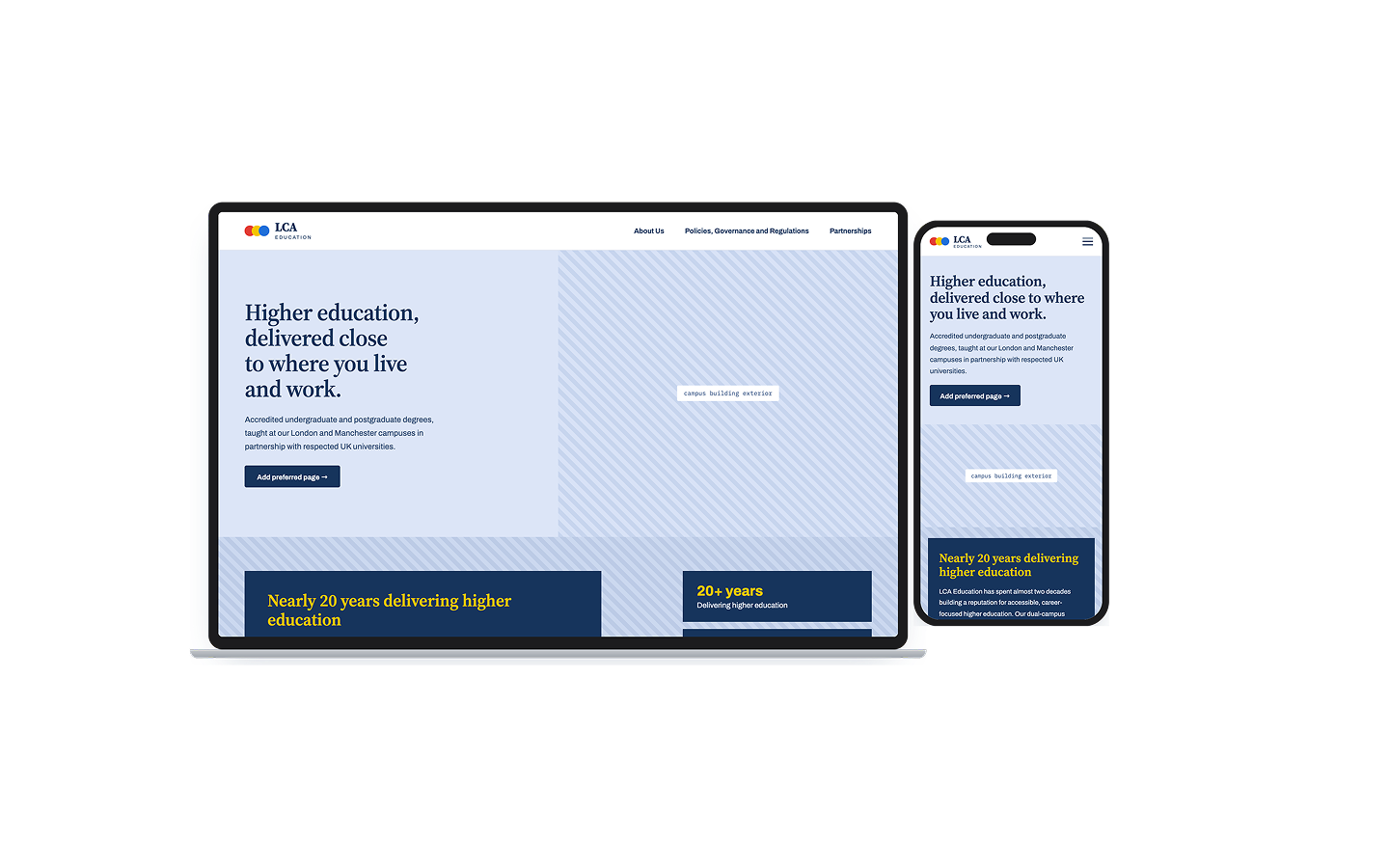
Designed LCA Education's compliance website end to end, taking ownership of the information architecture and every design decision from a domain, logo and list of eight pages with no structure yet.
I researched how comparable institutions present compliance content, delivered a mobile-first site built for an institutional audience, and shipped it within 3 weeks.
An engagement that later led to a second project auditing LCA's partner university websites.
Client
LCA Education
Timeline
3 weeks design
Role
UX & Product Designer
LCA Education compliance website

A new regulation.
A site that didn't exist.

LCA Education needed a dedicated compliance website to meet new UK government regulatory requirements introduced in April 2026. The site needed to publicly surface key institutional documents, governance, policies, regulations, and partnerships. In a way that was accessible, navigable, and credible.

They came to me with a domain, a logo, a colour direction, and a list of pages. The structure, the design, and the decisions were mine to make.

"We know what we need. We need someone to make it work."
— LCA Education brief

The brief covered eight pages:
• About Us • Meet the Team • Partnerships • Governance, Regulations, and Policies & Procedures.
Each had different content types and different user needs, a governance page is not read the same way as a team page.

The target audience is primarily institutional: students, regulators, partner universities, so the design needed to carry authority without feeling cold.
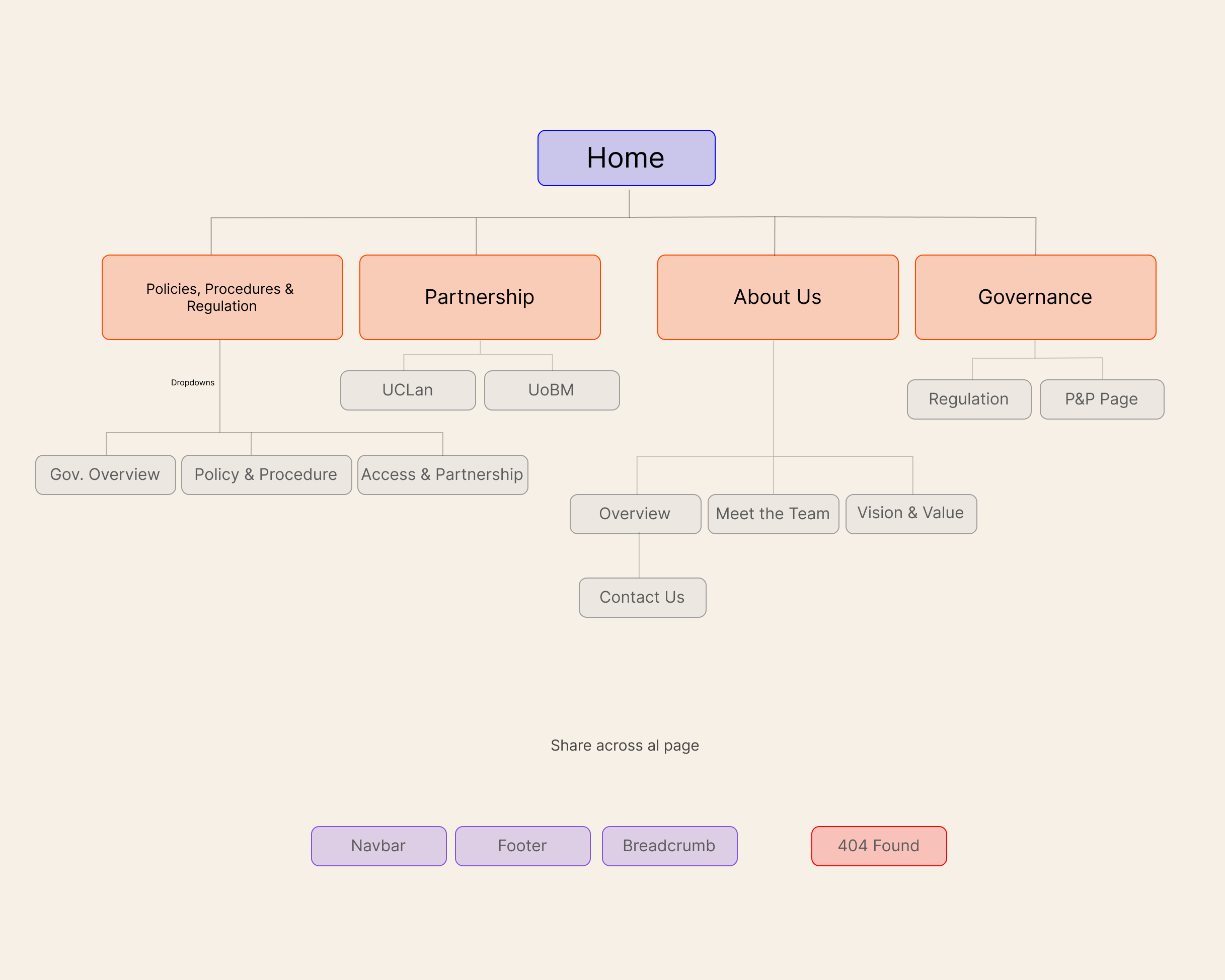


Page Map

What Oxford got wrong...

Before touching a wireframe, I explored how similar institutions present compliance content. Oxford, Cambridge, and several UK higher education providers informed the structural decisions.
How to handle heavy document pages, multiple navigation routes, and hierarchy across dense content.

Week 1

Research

Reviewed how Oxford, Cambridge and other UK institutions structure compliance content.
Found that dense document pages consistently failed on mobile. A pattern that shaped every structural decision that followed.

Week 1

Structure & IA

Mapped all eight pages into a single hierarchy.
• Governance and policy content needed depth
• About Us and Team needed warmth
Proposed two colour directions from LCA's existing brand guidelines to test which struck the right institutional tone.

Week 2

Low-fi Wireframes

Built low-fidelity wireframes mobile-first, based on the Week 1 finding that document-heavy pages break down on smaller screens.
Built in multiple navigation routes so regulators, students and partner institutions could each reach what they needed without cross-referencing menus.

Week 3–4

Revision & Handoff

Revision cycle with the client.
Blue selected as the colour direction that best balanced authority with approachability.
Final files handed to the developer, structured so LCA's team could edit content independently after launch.

Colour proposal 1
Colour proposal 2 — blue (selected)

Eight pages.
One coherent system.

Mobile-first
throughout

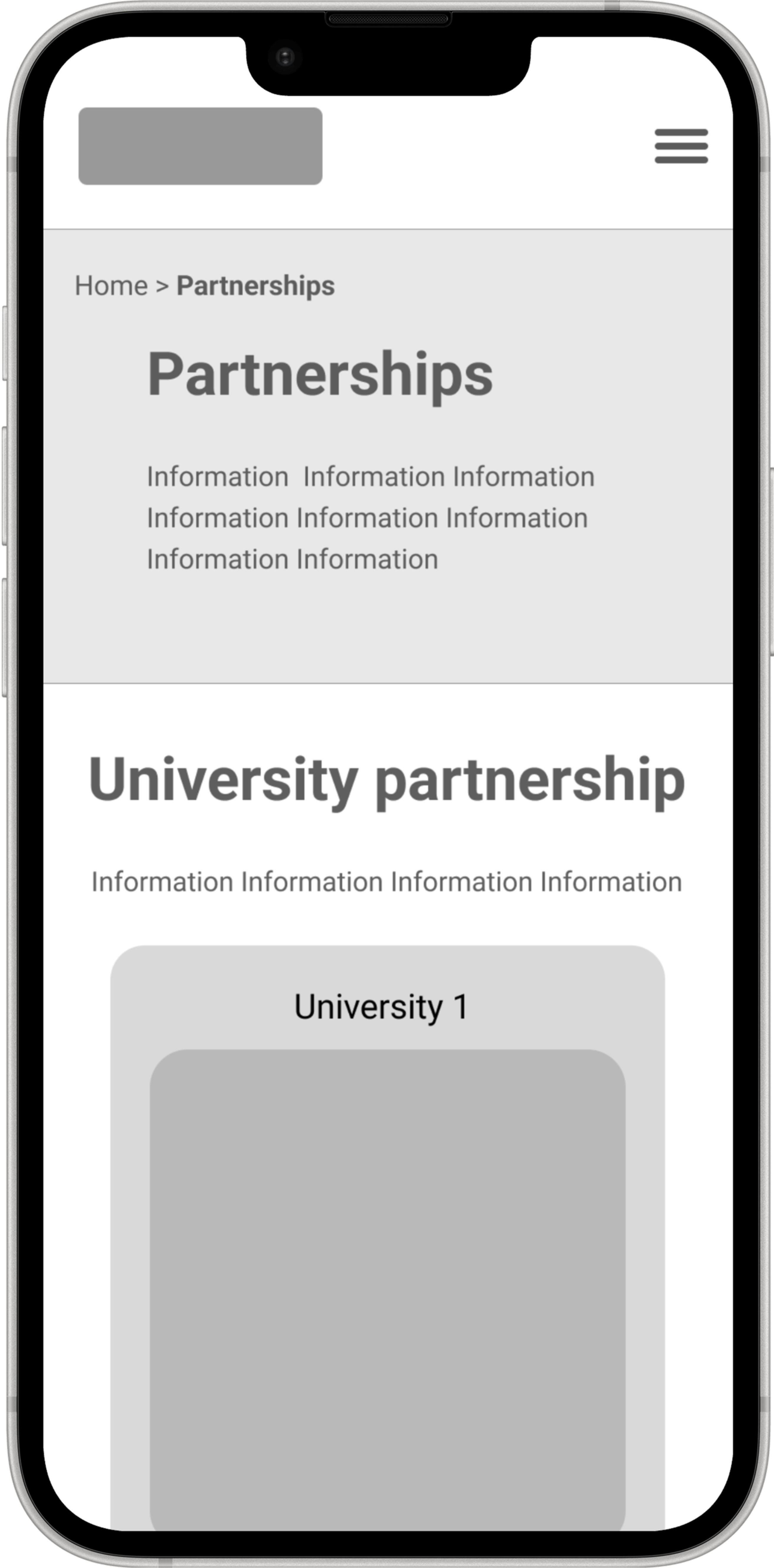
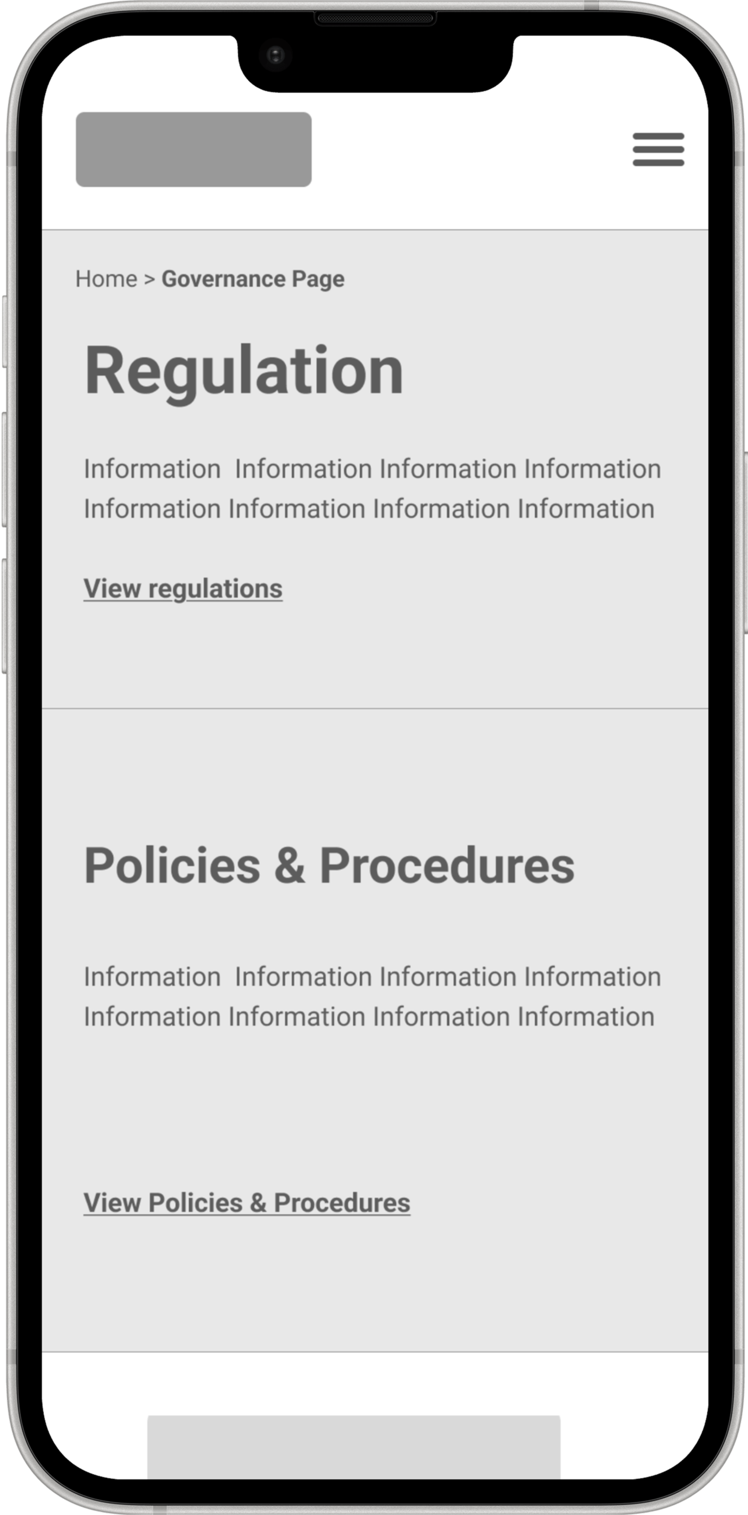
Built mobile-first, because that's where the Week 1 research showed document-heavy institutional sites usually fail.

  • Touch-friendly navigation and document links
  • Readable typography at small scale
  • Stacked layouts that don't lose hierarchy on narrow screens
  • Multiple navigation paths to the same content
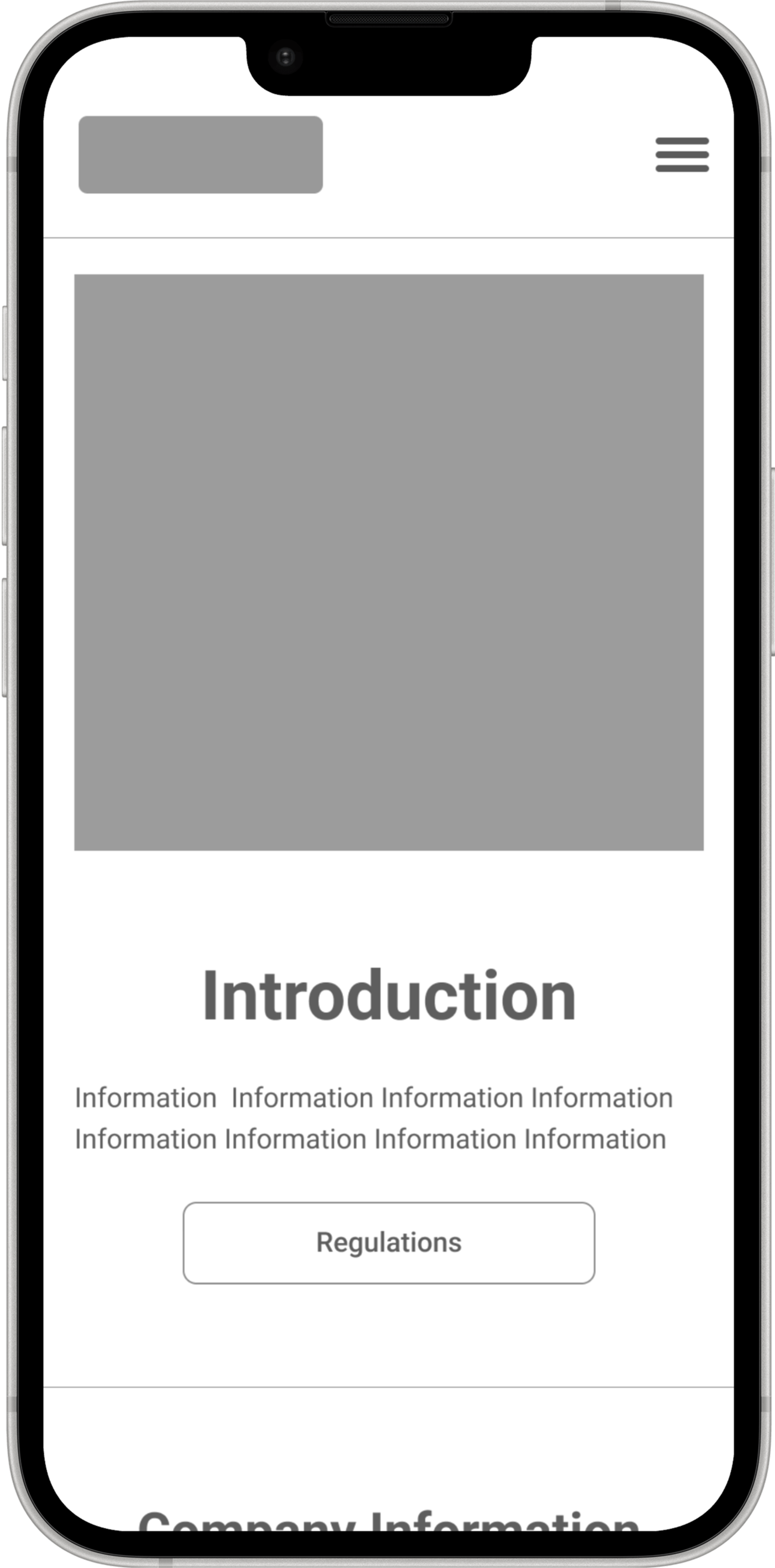
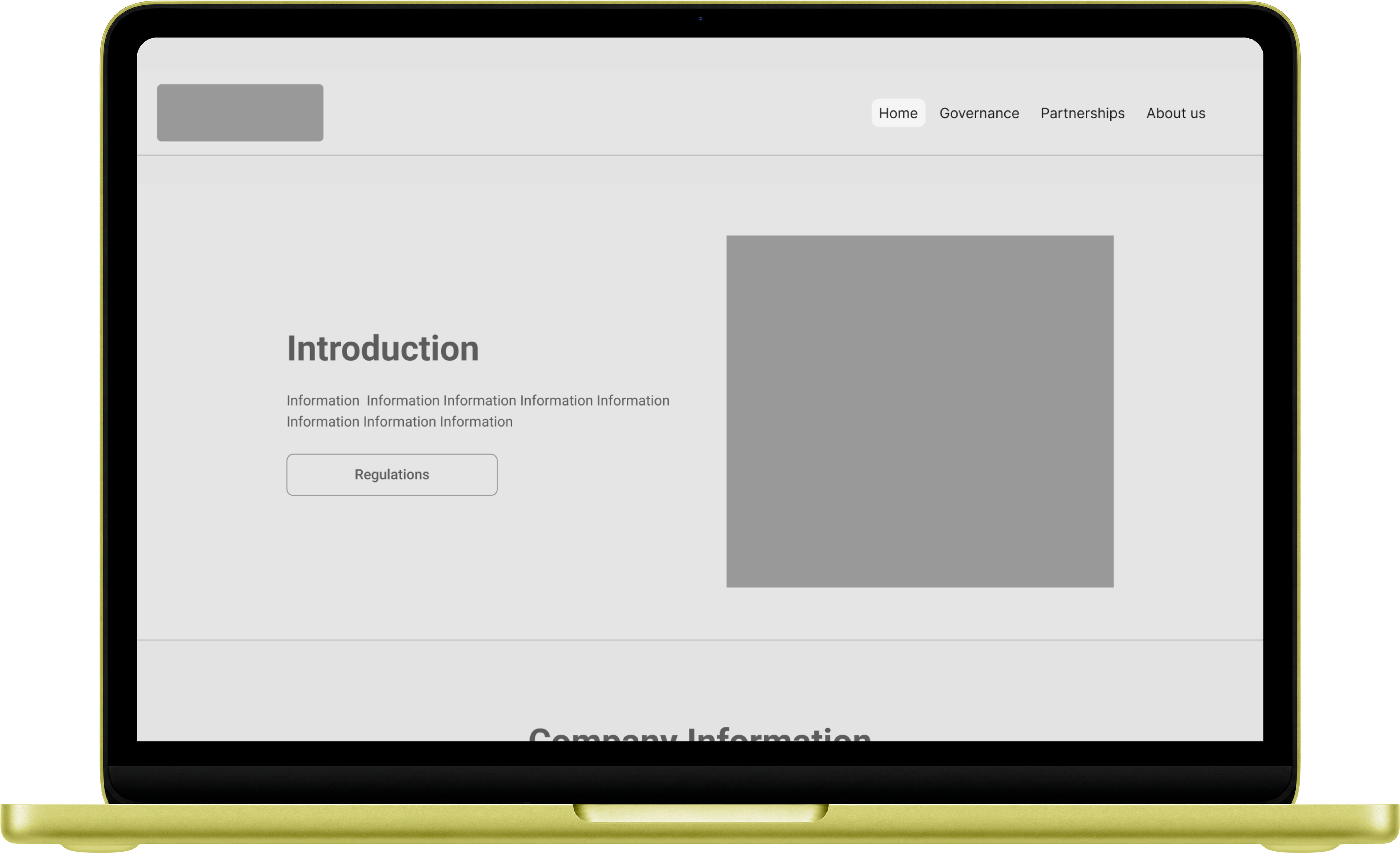
Mobile wireframe — home

Home

Mobile wireframe — governance

Governance

Mobile wireframe — partnerships

Policies

Desktop
structure

Desktop needed to carry institutional authority without feeling cold. The same tension we identified in the brief.
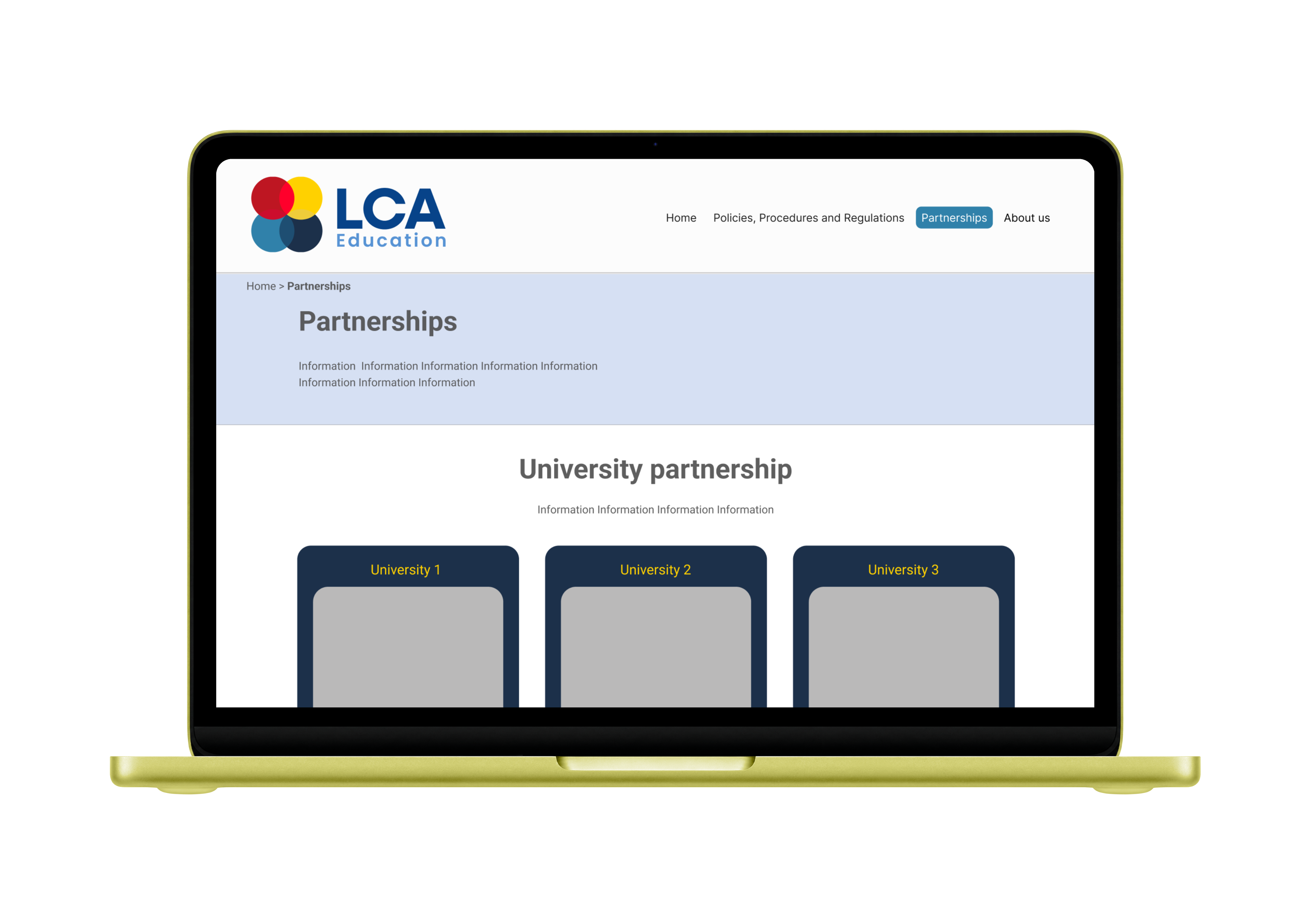
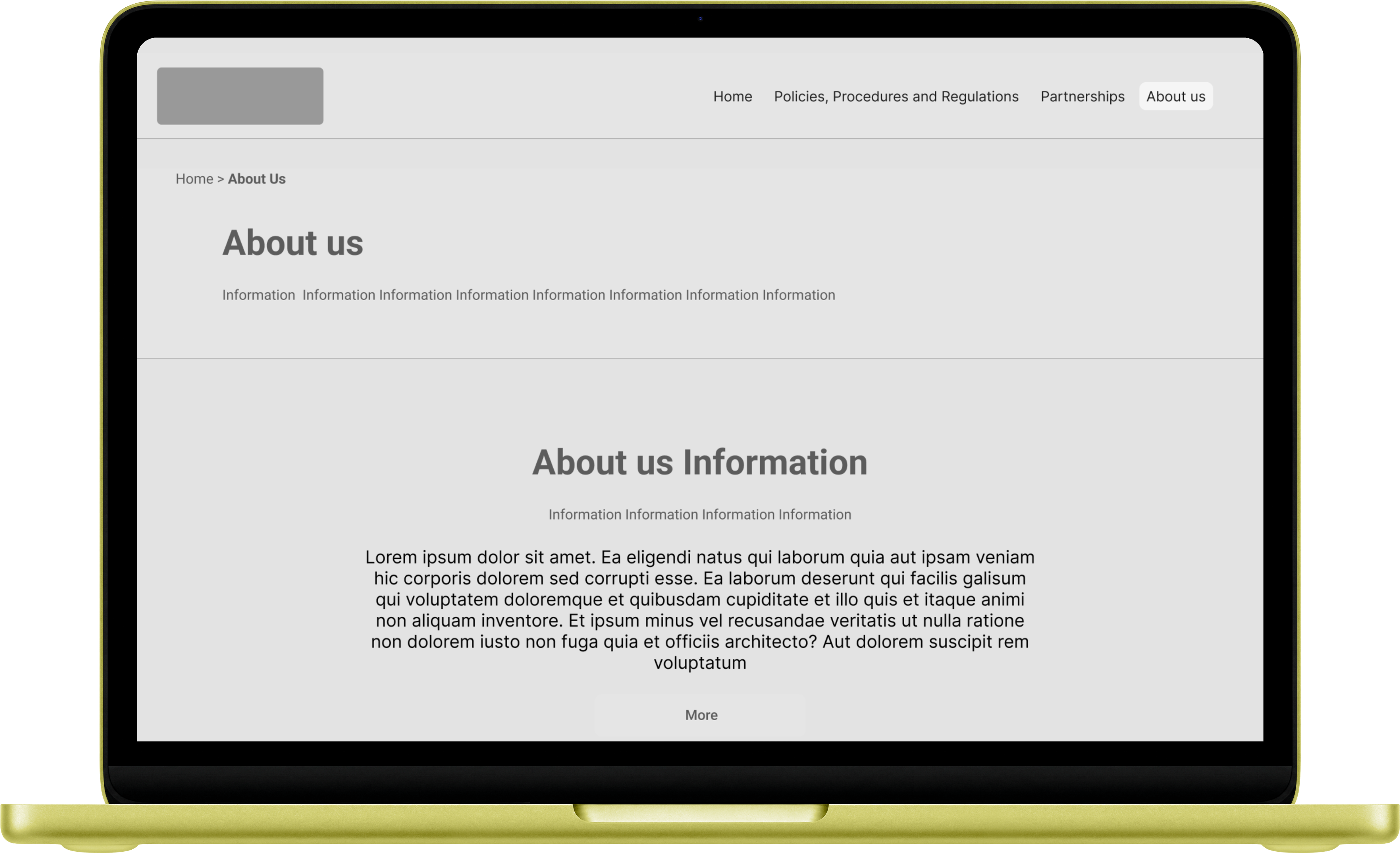
Grid-based layouts adapted per page type, giving governance and policy pages room to breathe while keeping About Us and Team pages warmer and more visual.

  • Grid-based layouts adapted per page type
  • Blue selected from two proposed colour directions
  • Typography system consistent across all eight pages
  • Developer-editable, content can be updated post-launch
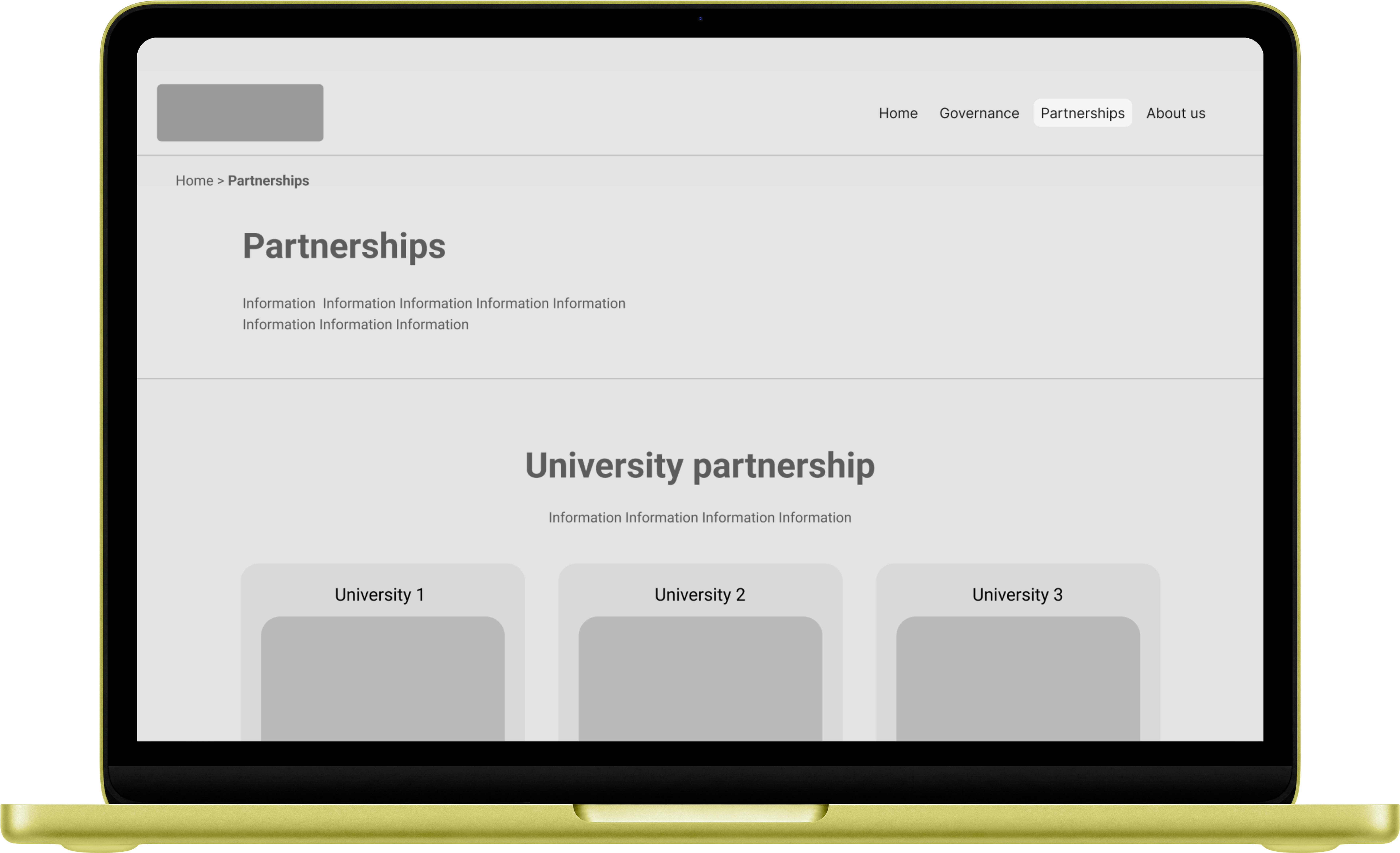
Desktop mockup — Home
Desktop mockup — About us
Desktop mockup — Partnerships

Designed, handed off,
going live this summer.

The full design was delivered within the agreed 4-week window and handed off to the development team.
The client can edit and post content independently post-launch, a deliberate decision from Week 1, not an afterthought.
The site is currently in development and expected to go live autumn 2026.

3 wks

Brief to developer handoff, including revision

8

Pages designed across compliance, governance and partnership content

Multiple

Navigation paths designed for governance officers, students and partner institutions

Also part of this engagement

UX Audit — Three University Websites
UX Audit
LCA Education

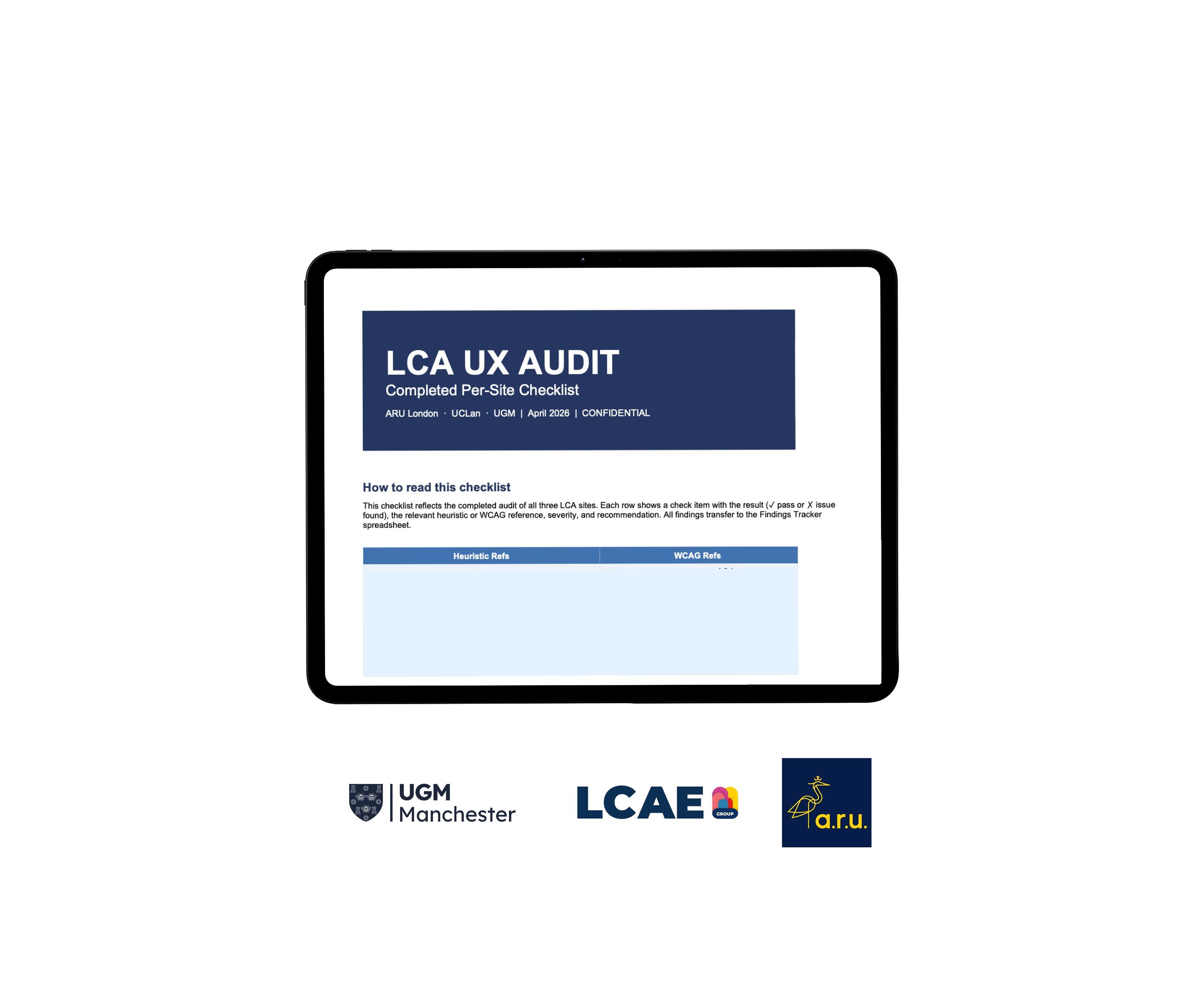
Running alongside the compliance website project, I audited 3 of LCA Education's key partner university websites, building the audit template and prioritisation framework from scratch.
Delivered a full report, Excel analysis, annotated screenshots and prioritised recommendations within two weeks.

Client
LCA Education
Timeline
2 weeks
Deliverables
Excel analysis
Annotated screenshots
Prioritised recommendations
LCA UX Audit

One framework.
Three very different sites.

LCA Education needed to understand how their partner and affiliated university websites performed from a UX perspective. What was working, what wasn't, and what needed to change.
The audit was not cosmetic. It was a functional assessment with commercial and compliance implications.

The three websites spanned different institutions with different design systems, content strategies and user bases. The audit needed to be consistent across all three while being specific enough to be actionable for each.


"We need to know where the problems are and what to do about them."

— LCA Education brief

Structured review.
Evidence at every step.

Each site was reviewed against the same criteria:
• Navigation
• Accessibility
• Content Hierarchy
• Mobile Performance
• User journeys

Findings could be compared fairly across three very different sites. Captured in Excel with severity ratings, annotated screenshots and prioritised recommendations.

Day 1–3

Heuristic Review

Reviewed all three sites against the same UX heuristics, logging every issue with severity, location and evidence.
The foundation the entire audit built from.

Day 4–6

Annotated Screenshots

Captured key issues visually, with annotations explaining exactly what was wrong and why.
Built so non-designers on LCA's team could understand the problem without needing it translated.

Day 7–9

Excel Analysis

Structured every finding in Excel by site, issue type, severity and priority.
Filterable, so LCA's team could work through fixes in whatever order made sense for them, not just the order I found them

Day 10–14

Report & Recommendations

Delivered a full written report with findings, analysis and prioritised recommendations.
Structured so LCA could act on the highest-severity issues first, without needing to read the whole document to know where to start.

What I found.
And what I recommended.

Navigation
Every site had a different idea of what 'important' meant.

Buried applications, missing filters, inconsistent labelling.
The pattern wasn't one bad site pulling down two good ones; each had its own version of the same underlying problem.

    • ARU London → Application status not visible until buried in entry requirements; Apply CTA leads to an intermediate page rather than a direct form

    • UCLan → No filter or search on the course listing page, making course discovery significantly harder

    • UGM → Strongest general usability of the three, but shared the same structural navigation inconsistencies


    Recommendation: Flatten navigation, surface critical information earlier in the user journey, and standardise labelling conventions across all three sites

Mobile
performance gaps

Mobile behaved differently on every site. Navigation disappearing mid-flow, colour themes shifting without warning, layouts assuming more screen space than was there.
None of it was intentional, and all of it was preventable with mobile testing before release.

    • ARU London → Site header and navigation disappear entirely during the application flow, leaving users disoriented

    • UCLan → Abrupt colour theme changes mid-scroll disorient users on course pages

    • UGM → Best performing for general usability but shared the same mobile accessibility failures


    Recommendation: Persistent navigation throughout all user journeys; validate all key pages on mobile before release

Content

Content spoke to what the institution needed to say, not what a visitor needed to find. Dense pages, buried information, PDFs standing in for actual content.
UGM was the exception, proving the other two weren't dealing with a harder problem, just a different set of choices.

    • ARU London → Application open/closed status not communicated clearly; requires development work to surface prominently

    • UCLan → Course pages lack clear calls to action; content hierarchy makes it difficult to identify next steps

    • UGM → Course discovery journey was the clearest of the three; a positive outlier in content structure

    Recommendatio: Rewrite key pages using plain language; surface critical information on-page rather than in PDFs; add clear CTAs to every key page

Accessibility
gaps

Every site failed the same three things and all three were fixable without a redesign.
This wasn't three separate accessibility problems, it was one shared blind spot across all of LCA's partner institutions.

  • All three sites: No visible keyboard focus indicator sitewide; a critical WCAG failure that excludes motor-impaired users
  • All three sites: No meaningful alt text on images; visually impaired users receive no image content information
  • All three sites: ARIA roles missing on hamburger menus; screen readers misidentify buttons as links
  • Recommendation: Implement visible keyboard focus indicator sitewide, add meaningful alt text to all non-decorative images, fix ARIA roles on all interactive elements.
    These three fixes alone resolve the most critical failures across all sites

Prioritised.
Not just documented.

The full audit was delivered within two weeks. Report, Excel analysis, and annotated screenshots, all built from the same framework applied consistently across all three sites.
Every recommendation was prioritised so the client knew what to address first.

3

University websites audited

2 wks

Brief to full delivery

62

Issues identified

Also part of this engagement

Compliance Website Design

Next project

Wilford — Luxury Brand Market Research